Soccerbible中文站 一旦分享,没有距离。
本站内容由soccerbible全球翻译小组提供,严禁转载,违者必究!
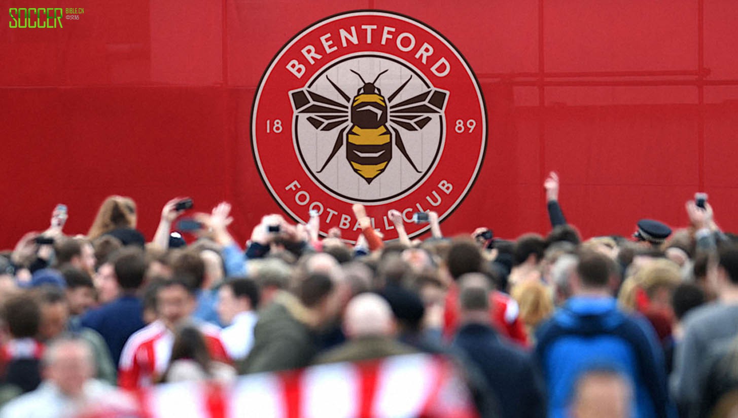
This is a new chapter for the club and indeed your collaboration. Where doyou start when a brief for something as big as redesigning a football club crest lands?
"It wasn’t as simple as the brief landing on our desks. When we first started working on the Brentford brand two years ago we identified the crest as an obvious area for improvement. But, although the limitations with their current crest were clear to us from the outset, it wasn’t something we were ever going to look at without a clear remit from the club and the fans. As part of our initial brand research we asked a wide range of fans and stakeholders their views on the current crest, in one-onone interviews and focus groups. We also kept a close eye on social media, blogs and unofficial fan forums to gauge opinion about the current crest. What quickly became clear was – partly because it was only designed in 1993 and has changed a lot over the years – their current crest wasn’t held as dear to fans as we had
expected. Many of the senior management of the club were also open to change, which gave us a clear remit to look at it."
Can you describe the core objectives behind the project and in turn, how you went about achieving them?
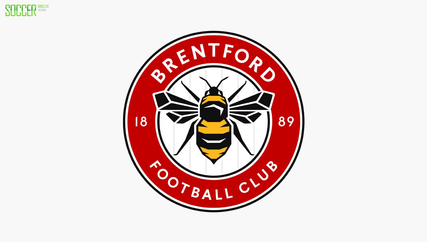
"Working closely with the club, we developed a detailed brief for the redesign. Broadly speaking it was divided into two parts. Firstly, it needed to solve the practical issues with their current crest, namely that it is too busy to replicate well at small sizes, it doesn’t work as a single colour version and was not designed with modern digital applications in mind. Secondly, we needed to create a crest that was far more recognisable. Their current crest is very cluttered and there are lots of elements fighting for attention. Brentford commissioned some research that told us it was far less recognisable than other London teams’ crests, which is something we needed to address given their ambitions to be a Premier League club and the necessity to grow off the pitch."
A club crest and badge is obviously quite a sensitive undertaking, given football is such a heartfelt game, did that bring an interesting challenge to the project?
"You could say that, yeah! I don’t think I’ve ever worked on something that will be scrutinised as closely by people who care so much. Brentford’s fans play an influential role in the club and rightly so – they have literally saved the club from extinction in recent years – so making sure we were being sensitive to the history and traditions of the club has probably been the defining feature of the project, right from the start. Whatever we did we knew some fans weren’t going to like it, but everything we’ve done has been with the club’s best interests at heart. We’ve done our very best to create something represents the club’s identity with much more impact and that all fans will grow to love."
What are the stand out elements of the badge that you've been able to take from Brentford as a whole and bring to a contemporary place?
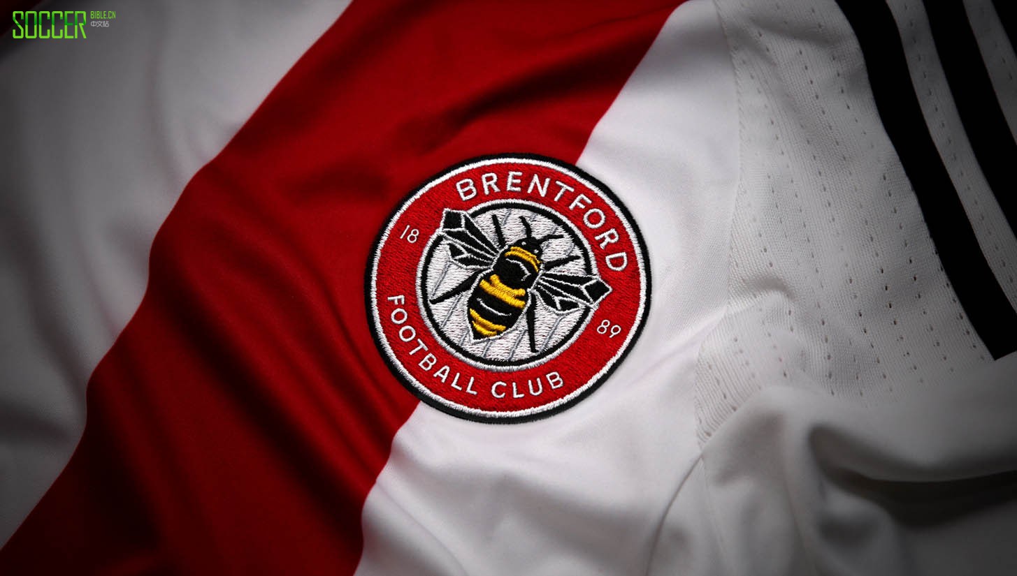
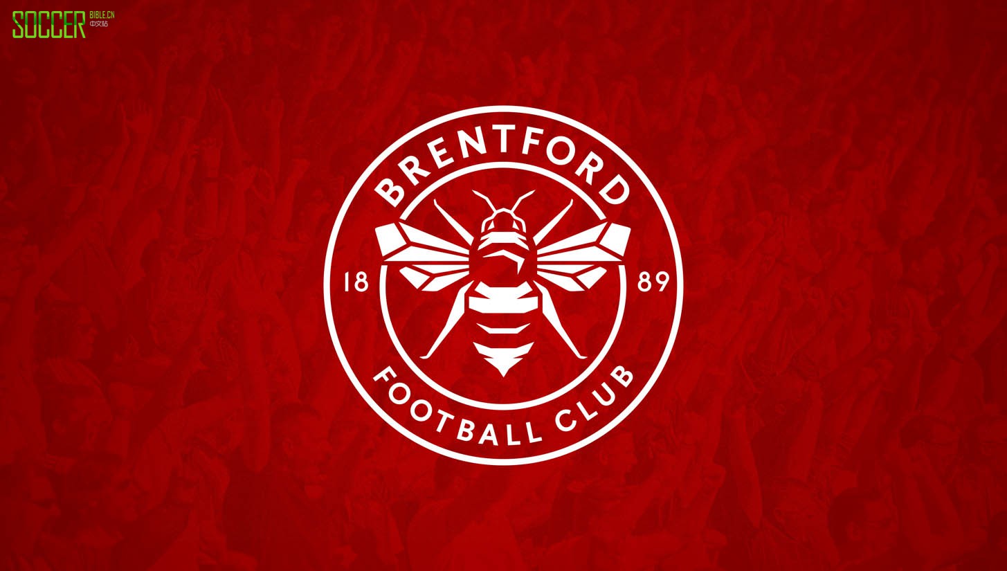
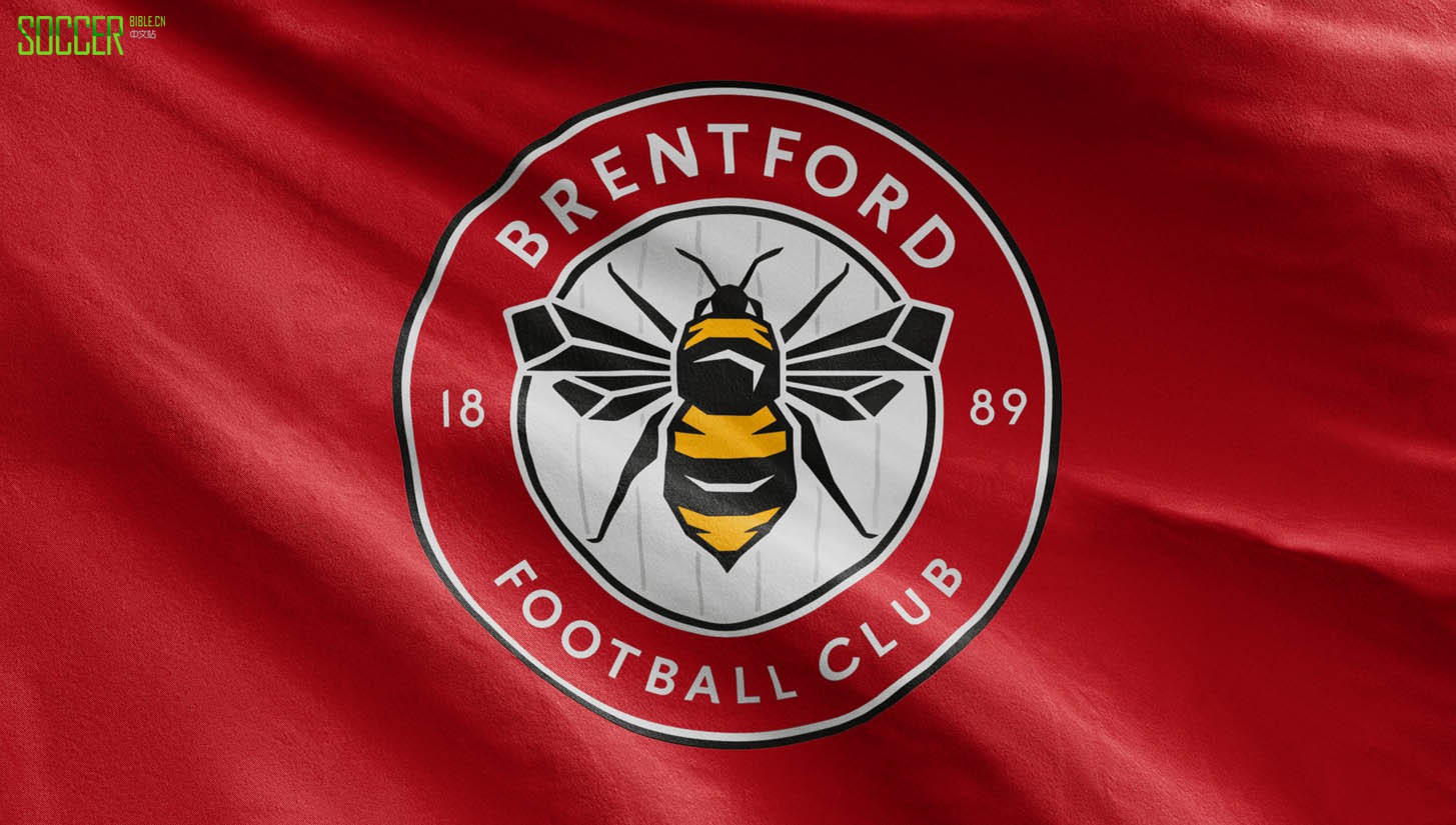
"Their current crest tries to cram loads of elements into one design. There are bees, a hive, swords, a crown, stripes and plenty of text too. With so much going on it was never going to be as simple as updating the styling like some recent crest redesigns. But we weren’t short of ingredients to work with! In our initial research we discovered that the bee was by far the most important element for supporters, and also the symbol that most instantly says ‘Brentford’. We knew we needed to include a bee and the year of foundation, and stripes were a ‘nice-to-have'. That gave us a clear starting point."
You've obviously had to put a lot of research and study into this, can you explain the inspiration you drew on for the redesign?
"We knew we had one shot at this, so we had to do a lot of research to make sure we got it right. As well as our consultation with fans and staff, we explored the world of sports crests in detail - from historic heraldic design to sleeker modern styles favoured in the MLS. We also looked at all the clubs that have updated their crests in recent years and the reasons behind each one. We analysed the crests of all Football League teams and grouped them into categories to try to objectively understand what makes a successful crest. Doing this analysis gave us some really specific principles that we knew we needed to achieve in the design, and a checklist we could judge each iteration by."
Was there a lot of influence from the wider design world than just what is going on in the game?
"We tried to avoid imposing any specific design aesthetic on the crest. That was never the point. The aim is that this crest will be used for 30, 40, 50 years or more, so we were always very conscious not to make it feel too current or on-trend. We were probably more influenced by the practicalities of the digital world than anything visual. Today a football club’s crest has to work in so many contexts, and who knows what media it will have to work in in future? We had to make sure it was as future proof, flexible and robust as possible, especially given the fact that often it will be third parties implementing it, in all sorts of applications."
Going full circle, what was the initial feedback like from the club? Can you explain the process as to how the final design came to fruition?
"Over the course of the process we must have created close to 100 crests. We looked at iterations and evolutions of all of Brentford’s historical crests, and narrowed them down in conversations with supporters, directors and the owner. People’s reactions were always going to be incredibly subjective, but we tried our best to make the selection and refinement process as objective as possible. It really helped having that clear checklist that we knew every design had to meet. By the end of the process we’d whittled down the options to a final shortlist of three, which we shared with the core steering group, the owner and a select group of fans. The final design was the overall favourite."
So when does the roll out commence? The whole club must receive an overhaul to incorporate the new branding?
"The new crest will be worn on shirts from the start of next season. Between now and then the club will be overhauling the rest of their communications and merchandise to include the new design."
As a statement of intent from the club, what message would you see this design gives off for a club moving forward into a new era?
"All the work we’ve done with Brentford is part of a plan to make sure their brand is Premier League-ready by the time they move into their new stadium in a couple of years. Yes it’s a new era, but I hope this new crest proves that, while always looking forward, Brentford are also committed to staying true to their history and traditions. Being brave enough and open enough to change their crest to something far more iconic and impactful is one of many signals that Brentford is a forward-thinking, progressive club – off the field as well as on it."
You can see more work from Article here and for more information on the crest redesign, head this way.
soccerbible中文站(soccerbible.cn)文章原文来自soccerbible英国站
内容均由网友投稿翻译,严禁任何形式转载,违者必究!
偶偶足球装备网(东莞偶偶网络科技有限公司)版权所有 粤ICP备11078889号-4 ©2012-2021 soccerbible.cn